- Understanding symbols that are recognizable to the audience
- Skeuomorphic symbol sketchs

- Common elements on a 320px x 320px grid
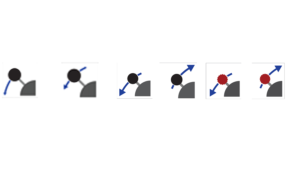
- Testing the designs are readable at 32px x32px
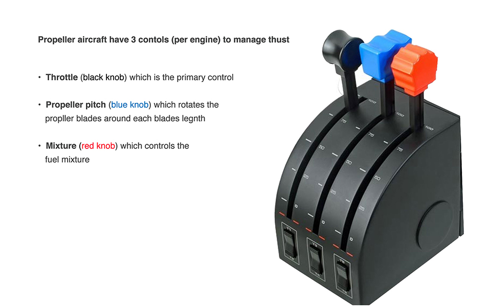
I start with understanding who the audience is and research what makes a symbol recognizable to them. For flight controls, I used the physical flight controls as a reference. The audience in this case are pilots who have an established visual vocabulary to work with.
I then devolve the skeuomorphic to develop flattened symbols easily recognizable by pilots. I like to first sketch these out using a Sharpie, which gives a nice thick line. Icons should not have any element smaller than 2 pixles so the Sharpie keeps me honest in this aspect.
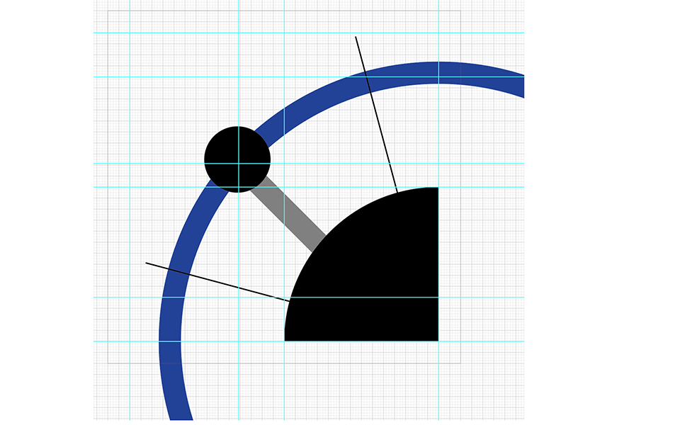
I then design the icons using common elements on a 320px x 320px grid.
Testing the design before it's refined allows me to see if the elements are readable at 32px x32px